この記事ではpythonのmatplotlibライブラリを使った棒グラフの描画方法をわかりやすく解説します。
サンプルコードをコピペしながらサクサク処理を試せますので、 ぜひ活用してみてくださいね。
棒グラフのシンプルな描画方法と、細かいオプション設定の方法を網羅的に紹介していきます。
目次
matplotlib.pyplot.bar の引数
matplotlib.pyplot.bar の引数は以下の通りです。(引用:matplotlib.pyplot.bar 公式ドキュメント)
| 引数名 | 意味 | デフォルト |
|---|---|---|
left | 棒のx座標 | |
height | 棒の高さ, y座標 | |
width | 棒の幅 | 0.8 |
bottom | 棒の下余白 | 0 |
align | 棒のx座標に対する配置"center", "edge" | "center" |
color | 棒の色 | |
edgecolor | 棒の枠線色 | |
linewidth | 棒の枠線の太さ | |
tick_label | x軸のラベル | |
xerr | x軸方向の誤差範囲 | |
yerr | y軸方向誤算範囲 | |
ecolor | 誤差範囲の色 | "black" |
capsize | 誤差範囲の傘のサイズ | 0.0 |
log | 対数目盛表示True, Flase | False |
基本的な棒グラフ
import matplotlib.pyplot as plt

left = [1, 2, 3, 4, 5]
height = [30, 40, 50, 60, 70]
plt.bar(left, height)
plt.show()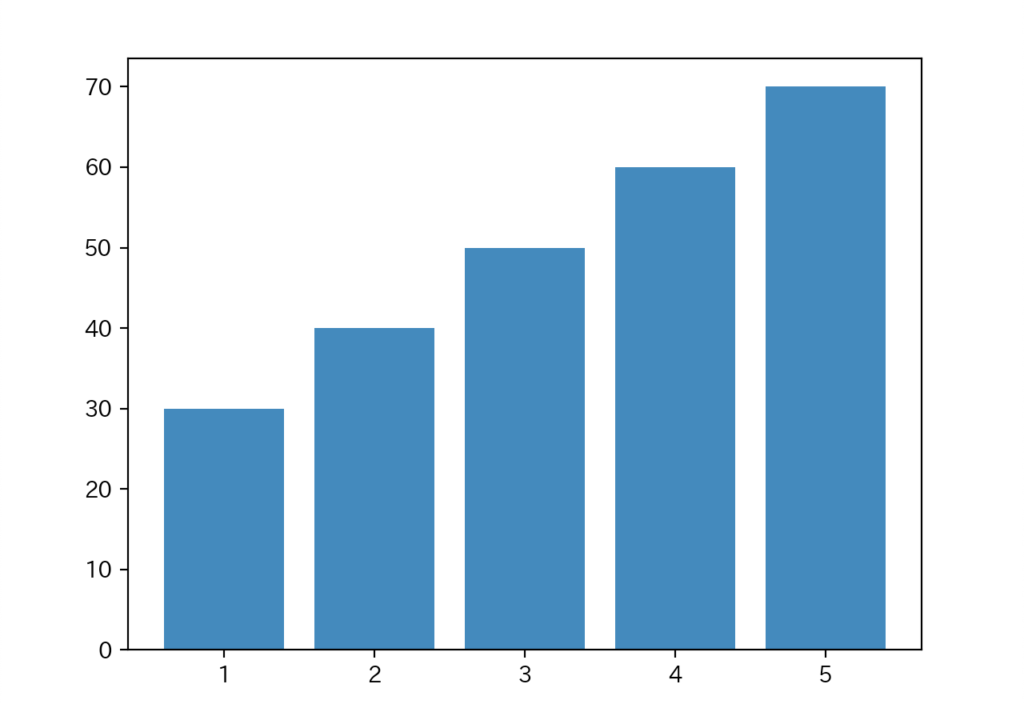
引数を特に指定しないシンプルな棒グラフです。
棒の幅width
import matplotlib.pyplot as plt

left = [1, 2, 3, 4, 5]
height = [30, 40, 50, 60, 70]
plt.bar(left, height, width=0.3)
plt.show()
棒の幅がやや小さくなったことがわかりますね。
棒のx座標に対する配置align
import matplotlib.pyplot as plt

left = [1, 2, 3, 4, 5]
height = [30, 40, 50, 60, 70]
plt.bar(left, height, width=0.3, align="edge")
plt.show()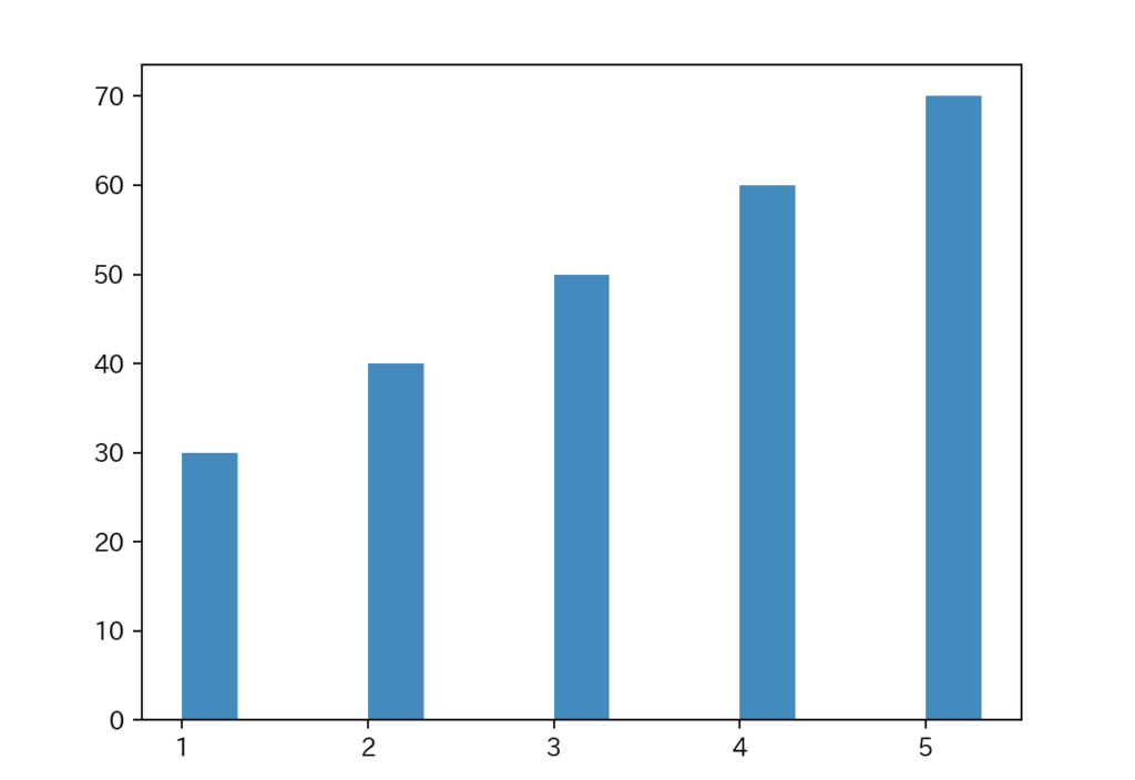
x座標の目盛に対して棒が縁に来るように描画されています。
引数alignで指定できるのは"center", "edge"の2種類です。
棒の色color
import matplotlib.pyplot as plt

left = [1, 2, 3, 4, 5]
height = [30, 40, 50, 60, 70]
plt.bar(left, height, width=0.3, color="#ff00c8")
plt.show()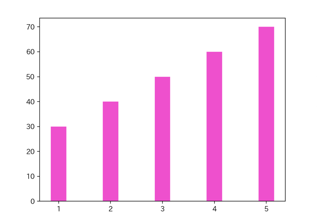
引数colorで指定できる色についてはこちらも合わせてどうぞ!!
あわせて読みたい

【python】matplotlibで色(color)を指定する方法
この記事ではmatplotlibライブラリでグラフの色を指定する方法をわかりやすく解説します。 サンプルコードをコピペしながらサクサク処理を試せますので、 ぜひ活用して…
棒の枠線の色edgecolor
import matplotlib.pyplot as plt

left = [1, 2, 3, 4, 5]
height = [30, 40, 50, 60, 70]
plt.bar(left, height, width=0.3, color="#ff00c8", edgecolor="black")
plt.show()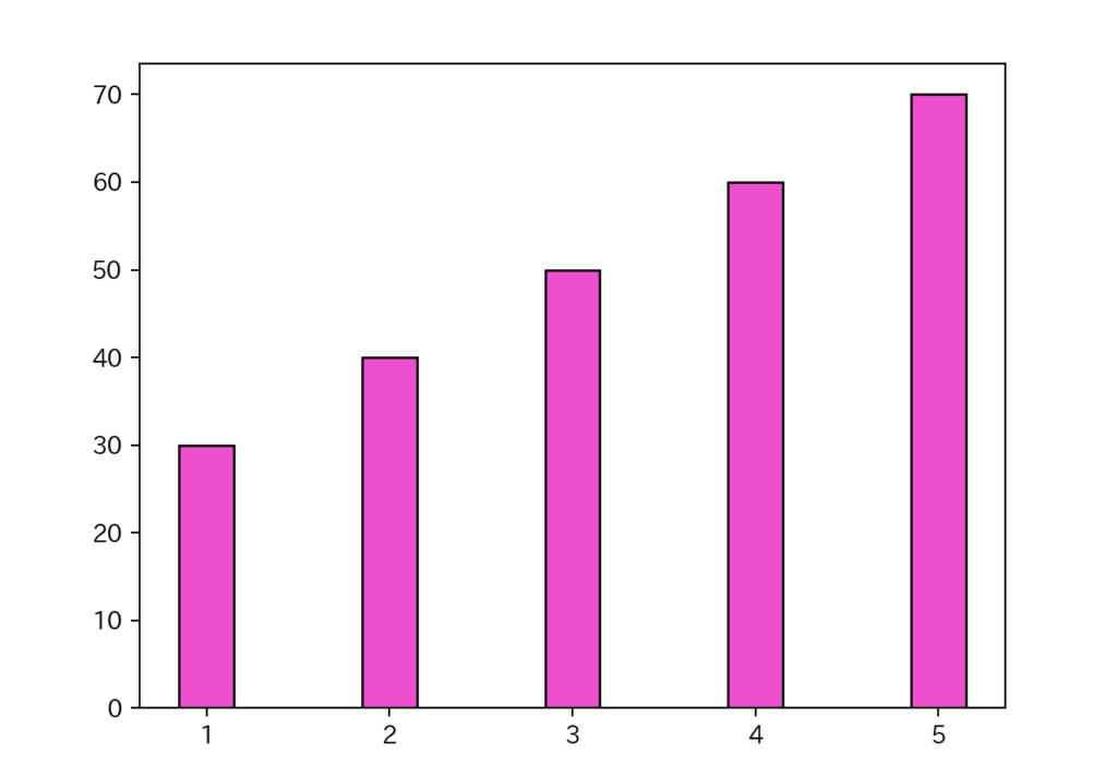
棒に黒の枠線が引かれていることがわかります。
棒の枠線の太さlinewidth
import matplotlib.pyplot as plt

left = [1, 2, 3, 4, 5]
height = [30, 40, 50, 60, 70]
plt.bar(left, height, width=0.3, color="#ff00c8", edgecolor="black", linewidth=3)
plt.show()
棒の枠線の太さが大きくなっていることがわかると思います。
x軸のラベルtick_label
import matplotlib.pyplot as plt

left = [1, 2, 3, 4, 5]
height = [30, 40, 50, 60, 70]
x_tick = ["Mon", "Tue", "Wed", "Thu", "Fri"]
plt.bar(left, height, width=0.3, tick_label=x_tick, edgecolor="black", linewidth=1)
plt.show()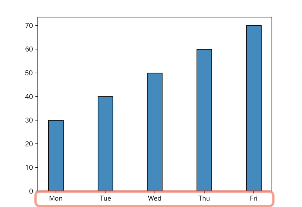
x軸の値を見てみると、引数tick_labelで指定した文字列に変わっていますね。(赤枠内)
x軸方向の誤差範囲xerr
import matplotlib.pyplot as plt

left = [1, 2, 3, 4, 5]
height = [30, 40, 50, 60, 70]
x_tick = ["Mon", "Tue", "Wed", "Thu", "Fri"]
plt.bar(left, height, width=0.3, xerr=0.5, tick_label=x_tick, edgecolor="black", linewidth=1)
plt.show()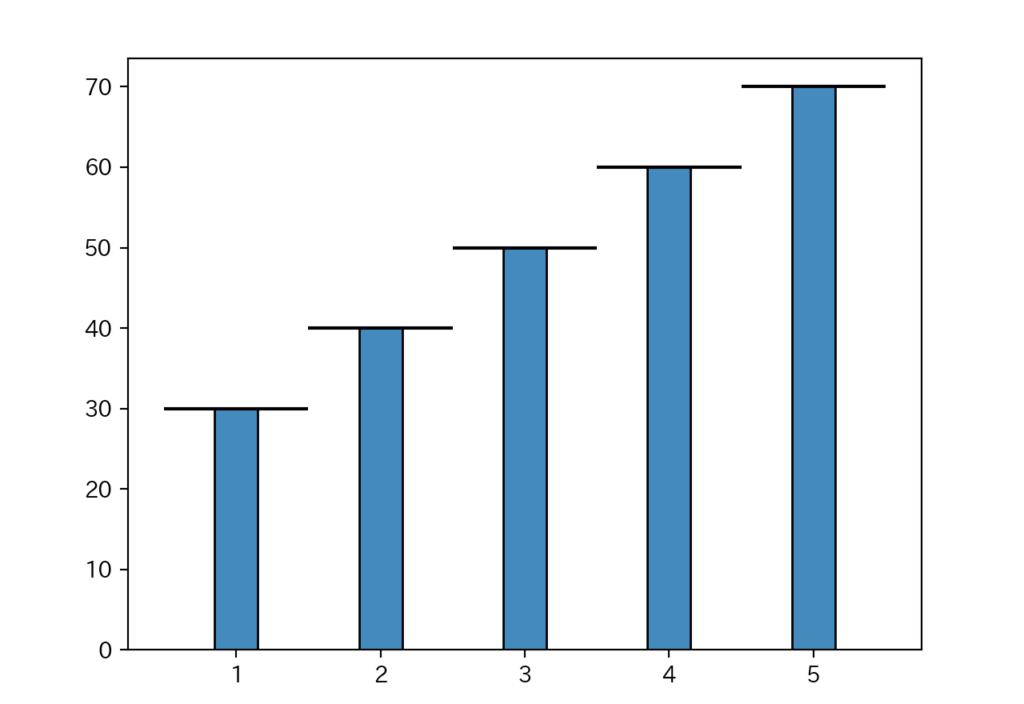
x軸方向に0.5の誤差範囲を指定したグラフです。
y軸方向の誤差範囲yerr
import matplotlib.pyplot as plt

left = [1, 2, 3, 4, 5]
height = [30, 40, 50, 60, 70]
x_tick = ["Mon", "Tue", "Wed", "Thu", "Fri"]
plt.bar(left, height, width=0.3, yerr=5, tick_label=x_tick, edgecolor="black", linewidth=1)
plt.show()
y軸方向に5の誤差範囲を指定したグラフです。
誤差範囲の色ecolor
import matplotlib.pyplot as plt

left = [1, 2, 3, 4, 5]
height = [30, 40, 50, 60, 70]
x_tick = ["Mon", "Tue", "Wed", "Thu", "Fri"]
plt.bar(left, height, width=0.3, ecolor="red", yerr=5, tick_label=x_tick, edgecolor="k")
plt.show()
誤差範囲の線の色が『赤』になっていることがわかりますね。
誤差範囲の傘のサイズcapsize
import matplotlib.pyplot as plt

left = [1, 2, 3, 4, 5]
height = [30, 40, 50, 60, 70]
x_tick = ["Mon", "Tue", "Wed", "Thu", "Fri"]
plt.bar(left, height, width=0.3, capsize=7, ecolor="r", yerr=5, tick_label=x_tick, edgecolor="k")
plt.show()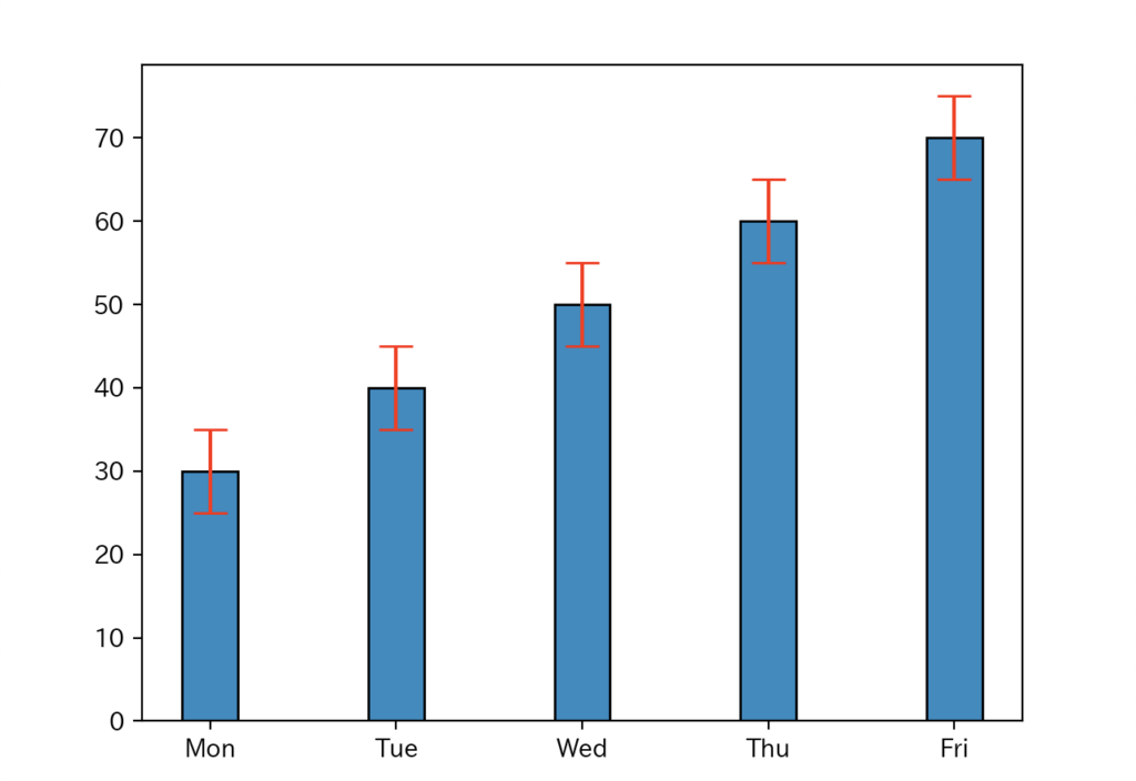
誤差範囲の傘のサイズ(capsize)を7と指定したグラフです。
積み上げ棒グラフ
matplotlib.pyplot.bar では、積み上げ棒グラフを描画することもできます。
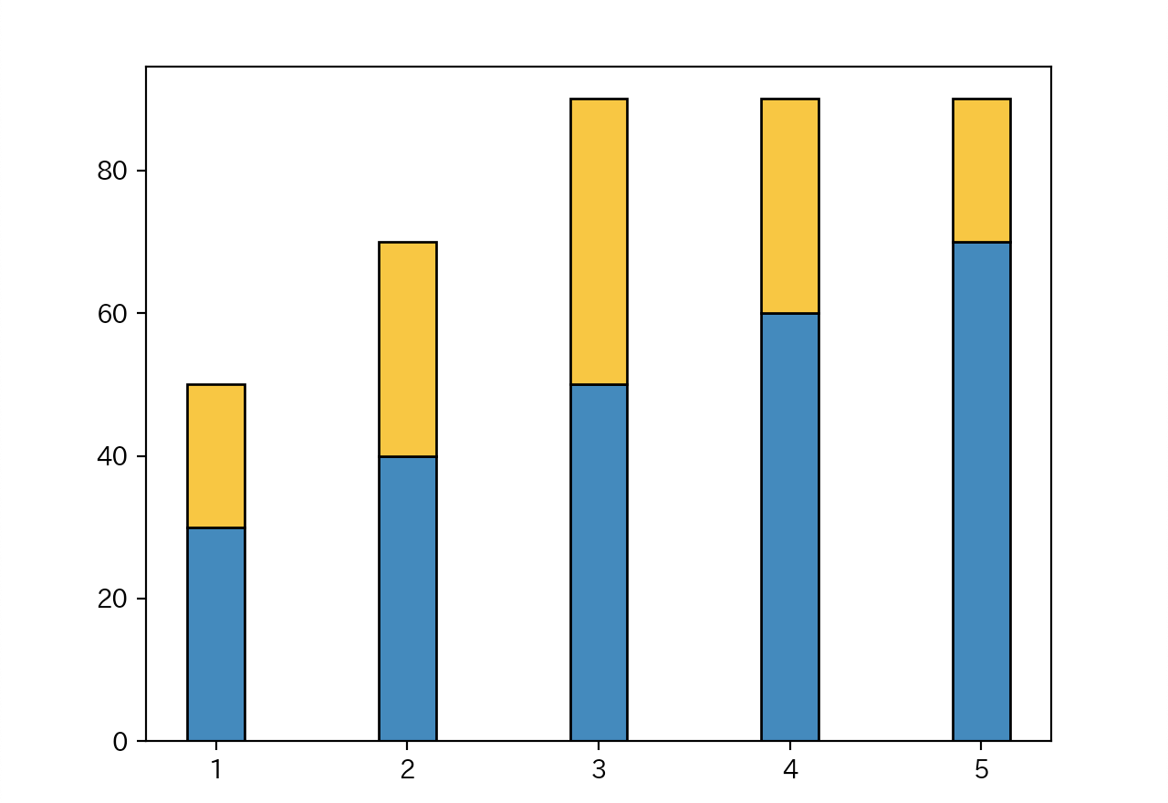
棒の下余白bottom
import matplotlib.pyplot as plt

left = [1, 2, 3, 4, 5]
height1 = [30, 40, 50, 60, 70]
height2 = [20, 30, 40, 30, 20]

plt.bar(left, height1, width=0.3, edgecolor="k")
plt.bar(left, height2, bottom=height1, width=0.3, color="#ffbb00", edgecolor="k")
plt.show()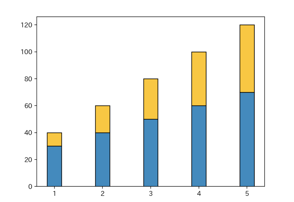
引数bottomに上に重ねるデータを指定することで積み上げ棒グラフを作成できます。
まとめ
pythonのmatplotlib.pyplot.bar を使った棒グラフの描画方法をまとめてみました。
棒グラフで設定できるオプションをひと通り紹介しましたので、ぜひ参考にしてみてください。