この記事ではmatplotlibライブラリで日本語を表示する方法をmacOS向けに具体的に解説します。
サンプルコードをコピペしながら、サクサク処理を試せますのでぜひ活用してみてください。
matplotlibの日本語文字化け
matplotlibでグラフ描画する際、グラフタイトルや軸ラベルを日本語で指定したら文字化けしてしまったのではないでしょうか。
import numpy as np
import matplotlib.pyplot as plt

x = np.linspace(0, np.pi*2)
y = np.sin(x)

# タイトル、軸ラベルを日本語で指定
plt.title("グラフタイトル", fontsize=25)
plt.xlabel("横軸ラベル", fontsize=20)
plt.ylabel("縦軸ラベル", fontsize=20)

for n in range(11):
    color_map = plt.get_cmap("prism")
    # 凡例を日本語で指定
    plt.plot(x, y-n, color=color_map(n/10), label="番号{}".format(n))

plt.legend()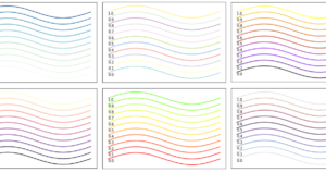
plt.show()グラフの設定に日本語を指定すると、日本語の部分だけが□□□□□のように文字化けを起こしてしまいます。
これはmatplotlibライブラリがデフォルトで日本語フォントに対応していないことが原因です。
以降の手順で日本語文字化けを解消していきましょう。
IPAexGothicフォントのダウンロード
まず初めに日本語に対応している汎用的な「IPAexGothic」というフォントをPCにダウンロードします。
IPAexGothicフォントは多種多様な情報機器におけるさまざまな場面で利用されており、漢字やひらがな、カタカナまですべてに対応しており利便性・汎用性の高いフォントです。
こちらからダウンロードすることができます。
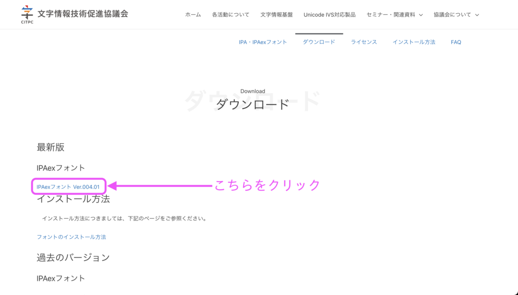
ダウンロード画面より下図のリンクをクリックします。
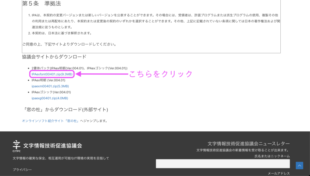
次の画面を下までスクロールするとzipファイルをダウンロードするリンクがあるのでクリックします。
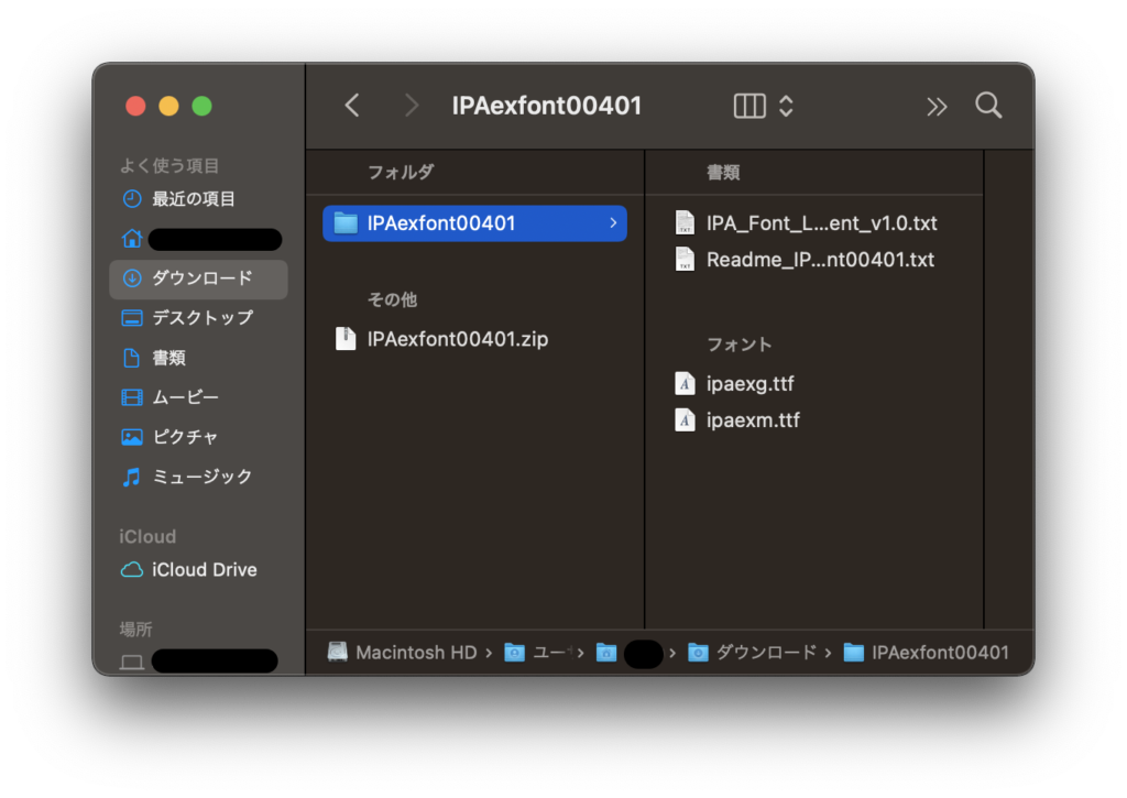
zipファイルをダウンロードし、そのまま解凍します。
続いてダウンロードしたフォントをPCに反映します。
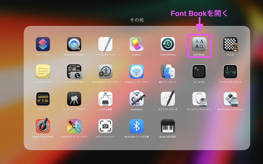
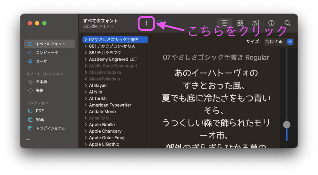
Launchpadから「Font Book」を開き、「+」マークをクリックしてフォントを追加します。
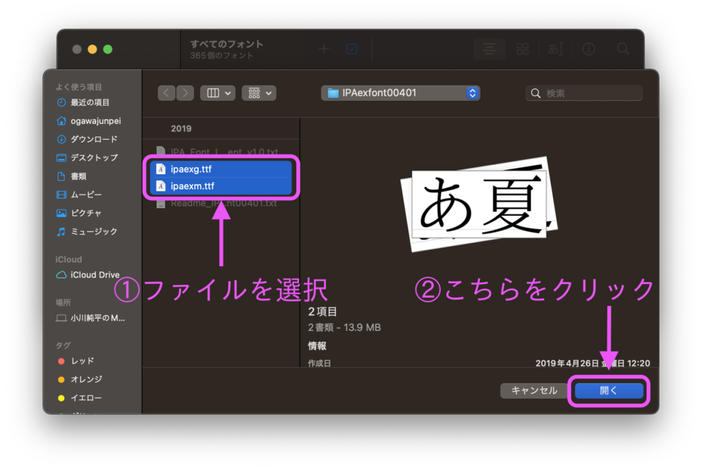
下図のような画面が表示されるので、先ほどダウンロードしたフォルダ内の「.ttf」ファイルを選択します。
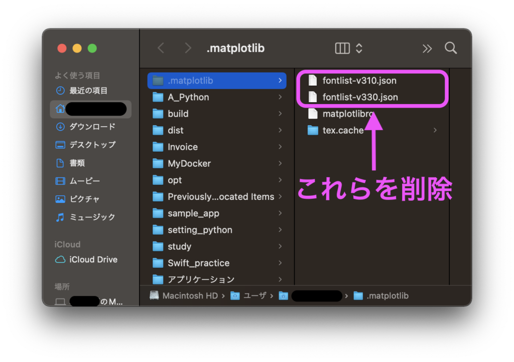
最後にmatploblibのフォントキャッシュを削除します。下記をターミナルで実行します。
cd
open .matplotlib
すると、下図のように「font-〜〜〜.json」というファイルが表示されるのでそれら(キャッシュ)を消去します。
以上で「IPAexGothic」フォントのインストール手順は完了です!!
matplotlibで日本語を表示する方法
matplotlibライブラリで日本語表示を可能にする方法を3つ紹介します。
matplotlibrcを書き換え
・設定ファイルを更新(永続的)
plt.rcParamsを設定
・コード冒頭で設定を明記
fontnameを指定
・テキストごとに毎回指定
理由としては、ご自身のPCで一度だけ設定してしまえば二度と設定する必要がなくなるからです。
ご自身のPC環境以外では他の二つの方法を使用すると良いでしょう。
matplotlibrcを書き換え
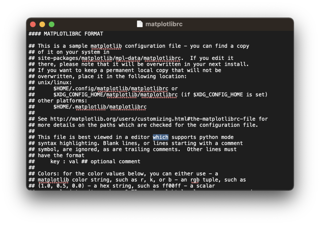
matplotlibライブラリのインストール時にPC上にmatplotlibrcファイルが自動作成されています。
matplotlibrcファイルの中身を書き換えて、日本語フォントを利用できるよう設定します。
matplotlibrcファイルを開くにはターミナルで下記を実行します。
cd
cd .matplotlib
open matplotlibrc
すると、下図のようなテキストエディタが開きます。
このファイル内の「font.family : 〜〜〜」という記載を変更することで日本語フォントを設定します。
エディタ内で「⌘キー」と「F」キーを同時に押し、検索機能で「font.family」を検索するとすぐに見つけられます。
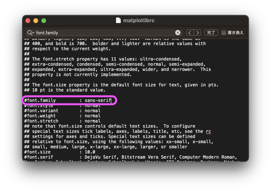
ここに記載されている「sans-serif」(デフォルト)を日本語対応のフォントに変更します。
先ほどダウンロードした「IPAexGothic」に書き換えましょう。
※ 行の先頭の「#」も消すことをお忘れなく。(#によるコメントアウトを解除します。)
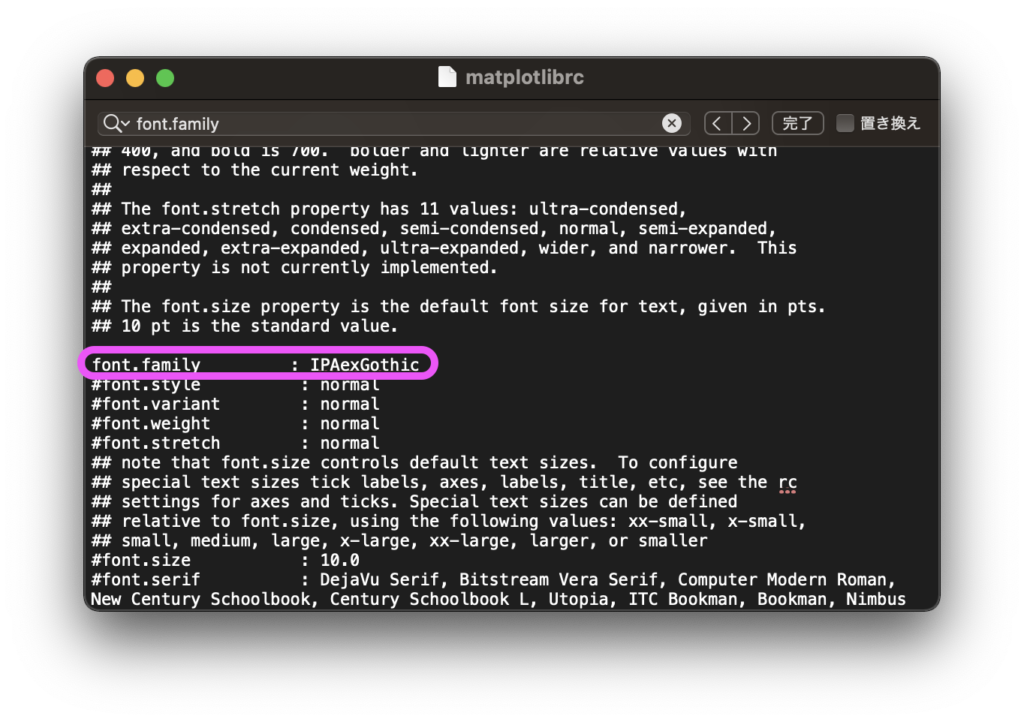
書き換えが終わったら、テキストエディタを保存(「⌘キー」+「S」)して閉じます。
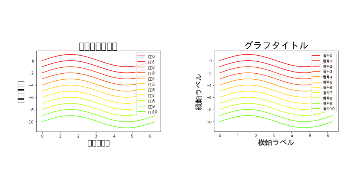
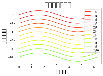
それでは、matplotlibに日本語フォントを指定したグラフを見てみましょう。
import numpy as np
import matplotlib.pyplot as plt

x = np.linspace(0, np.pi*2)
y = np.sin(x)

# タイトル、軸ラベルを日本語で指定
plt.title("グラフタイトル", fontsize=25)
plt.xlabel("横軸ラベル", fontsize=20)
plt.ylabel("縦軸ラベル", fontsize=20)

for n in range(11):
    color_map = plt.get_cmap("prism")
    # 凡例を日本語で指定
    plt.plot(x, y-n, color=color_map(n/10), label="番号{}".format(n))

plt.legend()
plt.show()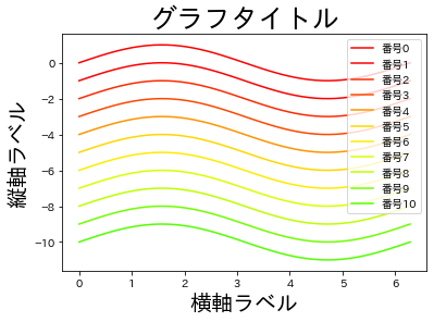
グラフタイトルと軸ラベルが日本語で正しく表示されていますね。
plt.rcParamsを指定
こちらの方法はプログラムコードの冒頭でmatplotlibに使用するフォントを明記する方法です。
plt.rcParams['font.family'] = "IPAexGothic"とすることでフォントを指定できます。
import numpy as np
import matplotlib.pyplot as plt

# プログラム冒頭であらかじめフォントを指定
plt.rcParams['font.family'] = "IPAexGothic"

x = np.linspace(0, np.pi*2)
y = np.sin(x)

# タイトル、軸ラベルを日本語で指定
plt.title("グラフタイトル", fontsize=25)
plt.xlabel("横軸ラベル", fontsize=20)
plt.ylabel("縦軸ラベル", fontsize=20)

for n in range(11):
    color_map = plt.get_cmap("prism")
    # 凡例を日本語で指定
    plt.plot(x, y-n, color=color_map(n/10), label="番号{}".format(n))

plt.legend()
plt.show()
プログラムコード冒頭で一度だけ明記すれば、コード内で表示するグラフはすべて指定したフォントになります。
fontnameを指定する
プログラムコード内のグラフ描画におけるテキストごとにフォントを指定することもできます。
この方法はテキストごとに別のフォントを指定できるという特徴があります。
import numpy as np
import matplotlib.pyplot as plt
import matplotlib

x = np.linspace(0, np.pi*2)
y = np.sin(x)

# タイトル、軸ラベルを日本語で指定
plt.title("グラフタイトル", fontsize=25, fontname="IPAexGothic")
plt.xlabel("横軸ラベル", fontsize=20, fontname="IPAexGothic")
plt.ylabel("縦軸ラベル", fontsize=20, fontname="IPAexGothic")

for n in range(11):
    color_map = plt.get_cmap("prism")
    # 凡例を日本語で指定
    plt.plot(x, y-n, color=color_map(n/10), label="No.{}".format(n))

plt.legend(prop={"family": "IPAexGothic"})
plt.show()fontnameでのフォント指定の場合、凡例(legend)には引数fontnameがないため引数propのfamilyで指定します。
すべてのテキストにfontnameを指定する必要があるため少し手間がかかります。
まとめ
今回はpythonのmatplotlibライブラリで日本語を表示する方法を具体的に紹介しました。
初めてmatplotlibを使う際は日本語表示に手間取るかもしれませんが、この記事を参考にぜひ解決してください。
他にもmatplotlibライブラリに関するおすすめ記事がありますので、ぜひ参考にしてみてください。