この記事ではmatplotlibライブラリで凡例を表示する方法をわかりやすく解説します。
サンプルコードをコピペしながらサクサク処理を試せますので、 ぜひ活用してみてください。
基本的な凡例を表示
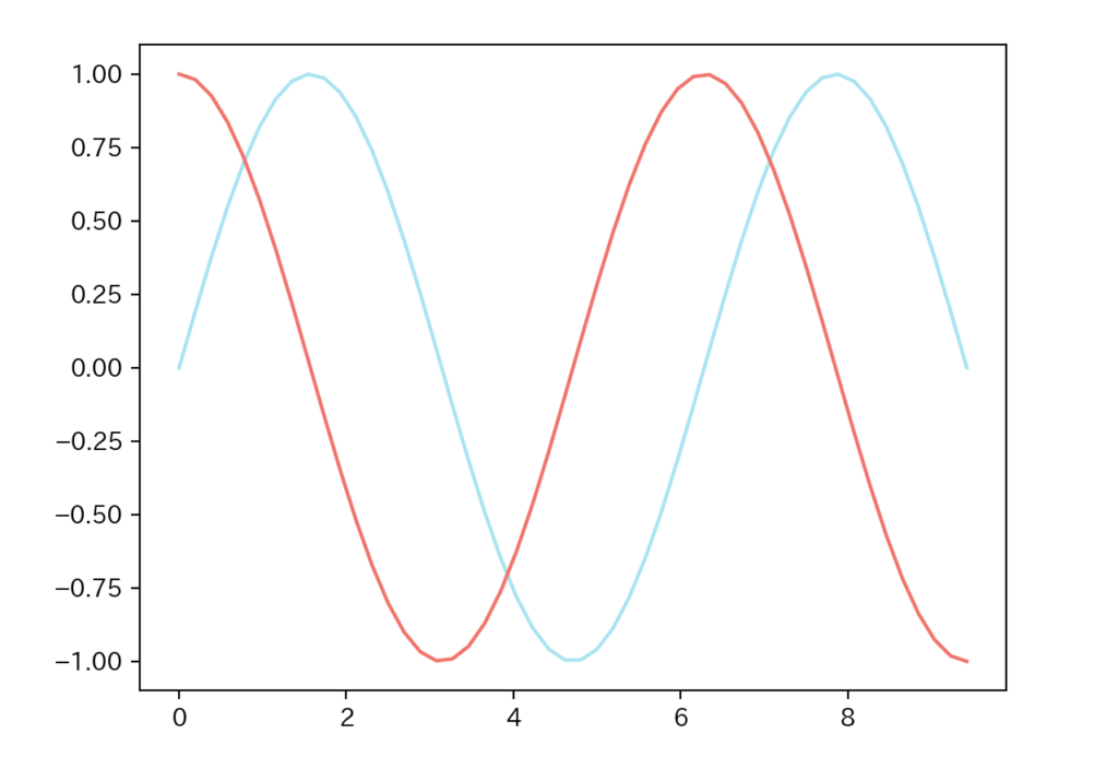
引数labelでグラフの凡例を指定し、plt.legend()で凡例を表示させることができます。
import numpy as np
import matplotlib.pyplot as plt

x = np.linspace(0, 3*np.pi)
y1 = np.sin(x)
y2 = np.cos(x)

# plotの引数labelを指定
plt.plot(x, y1, label="y=sin(x)", color="#88E0EF")
plt.plot(x, y2, label="y=cos(x)", color="#FF5151")

# 凡例を表示
plt.legend()
plt.show()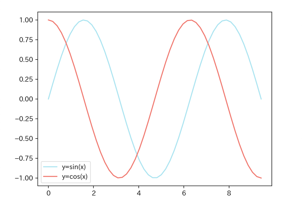
凡例の列数(ncol)
plt.legend()の引数ncolで列数を指定することができます。(デフォルトは1)
import numpy as np
import matplotlib.pyplot as plt

x = np.linspace(0, 3*np.pi)
y1 = np.sin(x)
y2 = np.cos(x)

plt.plot(x, y1, label="y=sin(x)", color="#88E0EF")
plt.plot(x, y2, label="y=cos(x)", color="#FF5151")

# 凡例の列数を指定
plt.legend(ncol=2)
plt.show()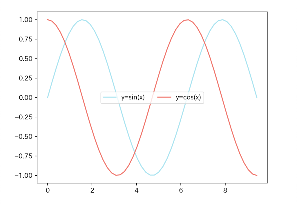
2と指定凡例の配置(loc)
グラフ内の凡例の配置を指定することができます。
import numpy as np
import matplotlib.pyplot as plt

x = np.linspace(0, 3*np.pi)
y1 = np.sin(x)
y2 = np.cos(x)

plt.plot(x, y1, label="y=sin(x)", color="#88E0EF")
plt.plot(x, y2, label="y=cos(x)", color="#FF5151")

# 凡例の配置を指定
plt.legend(loc="upper right")
plt.show()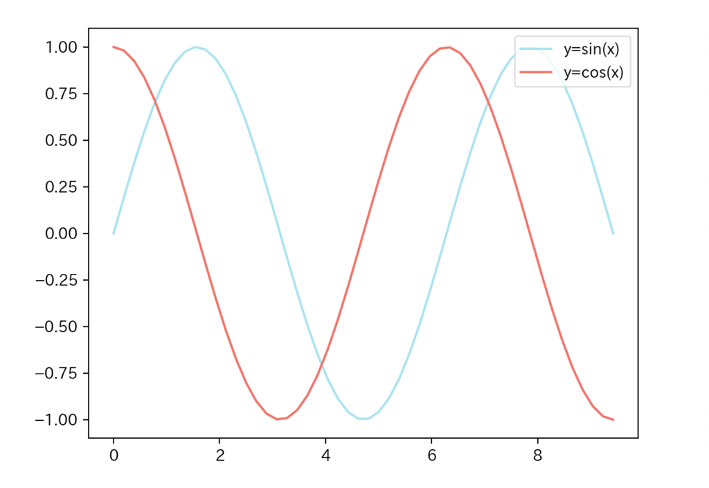
loc="best")引数locに指定可能な値は以下の通りです。(引用:matplotlib.pyplot.legend 公式ドキュメント)
| 引数locの値 | 意味 |
|---|---|
"best" | 最適な配置(自動) |
"upper right" | 右上 |
"upper left" | 左上 |
"lower right" | 右下 |
"lower left" | 左下 |
"right" | 右 |
"center left" | 中央左 |
"center right" | 中央右 |
"lower center" | 中央下 |
"upper center" | 中央上 |
"center" | 中央 |
凡例を自由な位置に配置(bbox_to_anchor)
引数bbox_to_anchorを用いることで凡例を好きな位置に配置することができます。
import numpy as np
import matplotlib.pyplot as plt

x = np.linspace(0, 3*np.pi)
y1 = np.sin(x)
y2 = np.cos(x)

plt.plot(x, y1, label="y=sin(x)", color="#88E0EF")
plt.plot(x, y2, label="y=cos(x)", color="#FF5151")
# 配置の基準座標を指定
plt.legend(bbox_to_anchor=(0.5, 1), loc="lower center")
plt.show()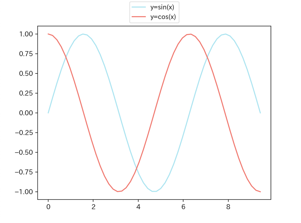

引数bbox_to_anchorの具体的な使い方を見ていきましょう。
下図のようにグラフの左下端を(x, y)=(0, 0)、右上端を(x, y)=(1, 1)として、引数bbox_to_anchorで(x, y)に指定した座標を基準に凡例を配置します。
※以下の例は引数loc="lower center"
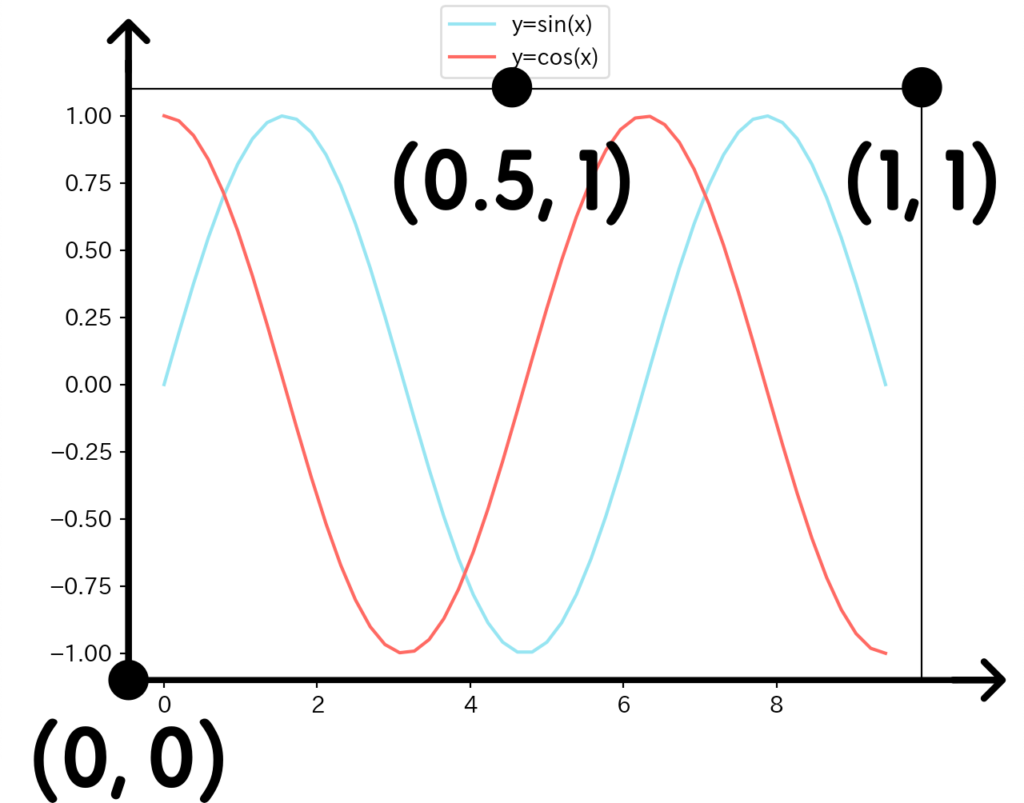
bbox_to_anchor=(0.5, 1)と指定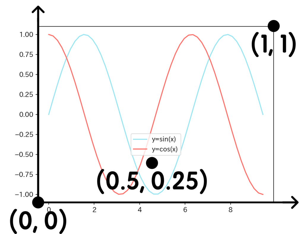
bbox_to_anchor=(0.5, 0.25)と指定凡例とマーカーの順序(markerfirst)
凡例とマーカーの順序を指定することができます。
import numpy as np
import matplotlib.pyplot as plt

x = np.linspace(0, 3*np.pi)
y1 = np.sin(x)
y2 = np.cos(x)

plt.plot(x, y1, label="y=sin(x)", color="#88E0EF")
plt.plot(x, y2, label="y=cos(x)", color="#FF5151")

plt.legend(markerfirst=False)
plt.show()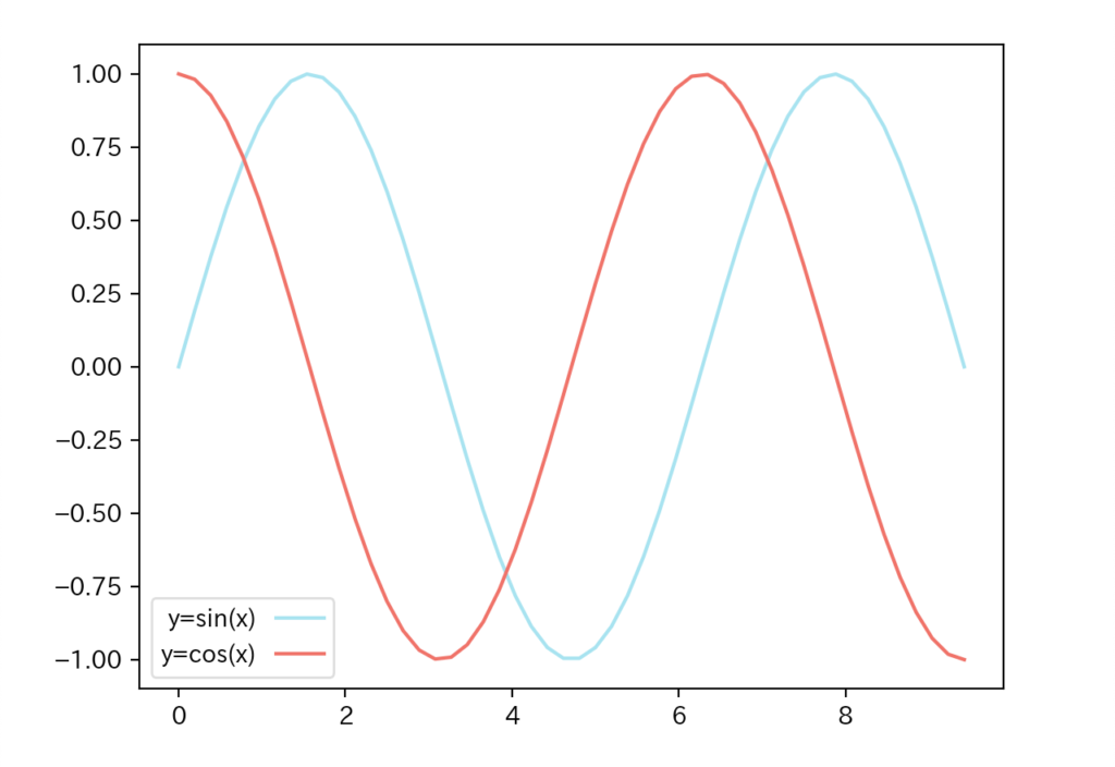
凡例のフォントサイズ(fontsize)
凡例の文字の大きさを指定してみましょう。
import numpy as np
import matplotlib.pyplot as plt

x = np.linspace(0, 3*np.pi)
y1 = np.sin(x)
y2 = np.cos(x)

plt.plot(x, y1, label="y=sin(x)", color="#88E0EF")
plt.plot(x, y2, label="y=cos(x)", color="#FF5151")

# 凡例のフォントサイズを指定
plt.legend(fontsize=20, loc="lower left")
plt.show()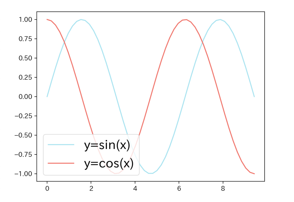
20に指定凡例の枠線の有無(frameon)
凡例の枠線の有無を指定することができます。
import numpy as np
import matplotlib.pyplot as plt

x = np.linspace(0, 3*np.pi)
y1 = np.sin(x)
y2 = np.cos(x)

fig = plt.figure()
plt.plot(x, y1, label="y=sin(x)", color="#88E0EF")
plt.plot(x, y2, label="y=cos(x)", color="#FF5151")

# 凡例の枠線を無しに指定
plt.legend(frameon=False)
plt.show()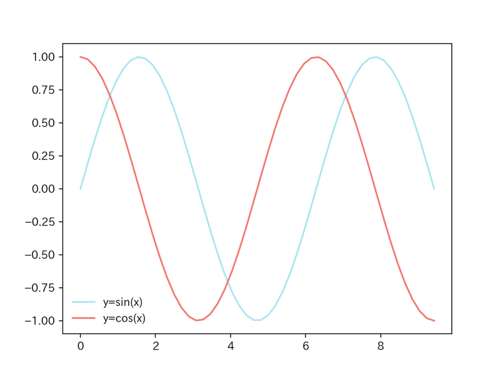

引数frameonをFalseとすれば、凡例の枠線をなくすことができます。
凡例の枠線の角を丸める(fancybox)
凡例の枠線の丸まりの有無を指定することができます。
import numpy as np
import matplotlib.pyplot as plt

x = np.linspace(0, 3*np.pi)
y1 = np.sin(x)
y2 = np.cos(x)

fig = plt.figure()
plt.plot(x, y1, label="y=sin(x)", color="#88E0EF")
plt.plot(x, y2, label="y=cos(x)", color="#FF5151")

# 枠線の角を丸めない
plt.legend(fancybox=False, fontsize=20, loc="lower left")
plt.show()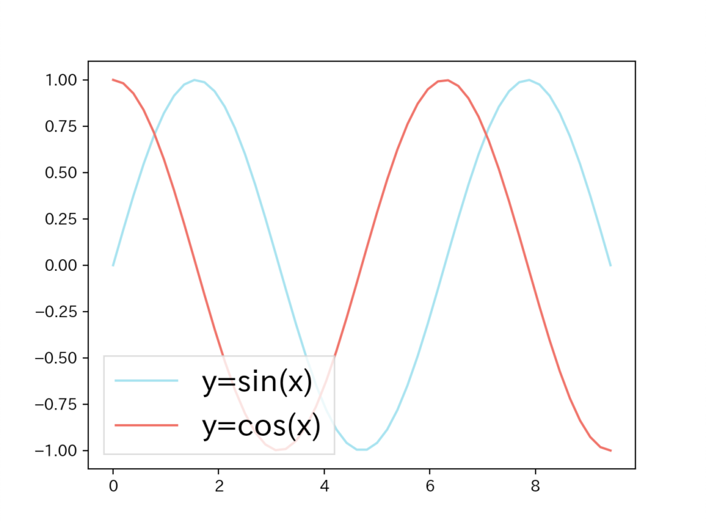

引数fancyboxをFalseとすると、わずかに枠線の角が丸まりがなくなっていることがわかります。
凡例の背景色(facecolor)
凡例の背景色を指定してみましょう。
import numpy as np
import matplotlib.pyplot as plt

x = np.linspace(0, 3*np.pi)
y1 = np.sin(x)
y2 = np.cos(x)

plt.plot(x, y1, label="y=sin(x)", color="#88E0EF")
plt.plot(x, y2, label="y=cos(x)", color="#FF5151")

# 凡例の背景色を指定
plt.legend(facecolor="#0099ff", loc="lower left")
plt.show()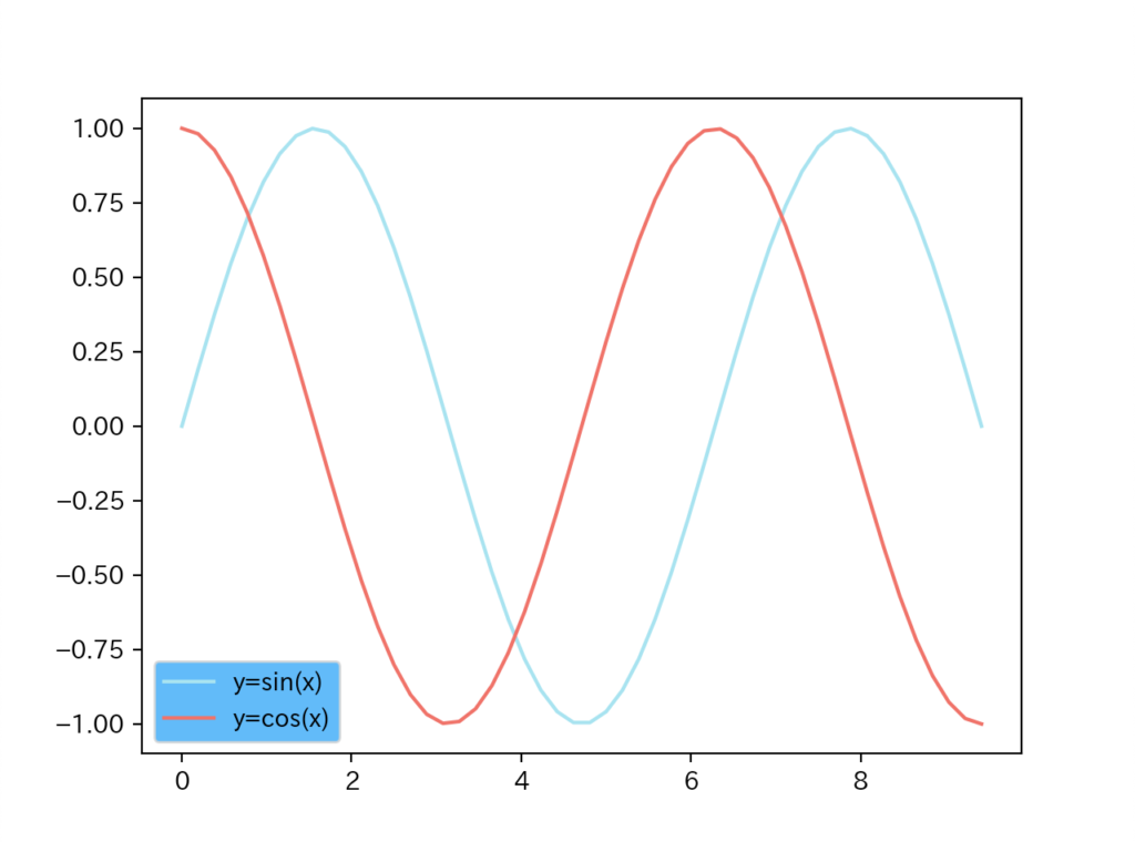
凡例の背景透過(framealpha)
凡例の背景を透過してみましょう。
import numpy as np
import matplotlib.pyplot as plt

x = np.linspace(0, 3*np.pi)
y1 = np.sin(x)
y2 = np.cos(x)

# わかりやすいようにグラフに背景色を指定
plt.rcParams["axes.facecolor"] = "#afafaf"
plt.plot(x, y1, label="y=sin(x)", color="#88E0EF")
plt.plot(x, y2, label="y=cos(x)", color="#FF5151")

# 凡例の背景透過を指定
plt.legend(framealpha=0.2, facecolor="#0099ff", loc="lower left")
plt.show()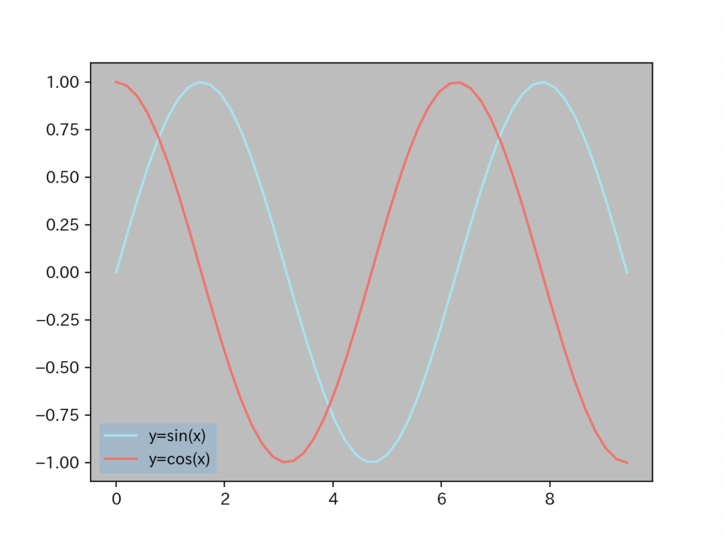
framealpha=0.2と指定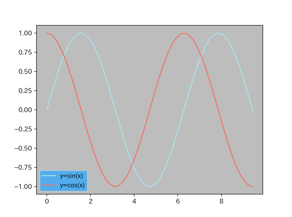
ここでは、背景透過がわかりやすいようにグラフに灰色の背景色を指定しています。
凡例の背景を透過する場合は、引数framealphaに0(完全透過)〜1(透過無し)の値を指定します。
凡例の枠線の色(edgecolor)
凡例の枠線の色を指定してみましょう。
import numpy as np
import matplotlib.pyplot as plt

x = np.linspace(0, 3*np.pi)
y1 = np.sin(x)
y2 = np.cos(x)

plt.plot(x, y1, label="y=sin(x)", color="#88E0EF")
plt.plot(x, y2, label="y=cos(x)", color="#FF5151")

# 凡例の枠線の色を指定
plt.legend(edgecolor="#ff0000", loc="lower left")
plt.show()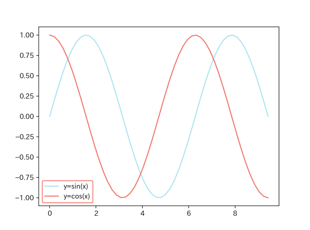
"ff0000"と指定引数edgecolorを指定することで枠線に任意の色を付けることができます。
凡例の横幅(mode)
凡例の横幅を指定してみましょう。
import numpy as np
import matplotlib.pyplot as plt

x = np.linspace(0, 3*np.pi)
y1 = np.sin(x)
y2 = np.cos(x)

plt.plot(x, y1, label="y=sin(x)", color="#88E0EF")
plt.plot(x, y2, label="y=cos(x)", color="#FF5151")

# 凡例の横幅を指定
plt.legend(mode="expand", loc="lower left")
plt.show()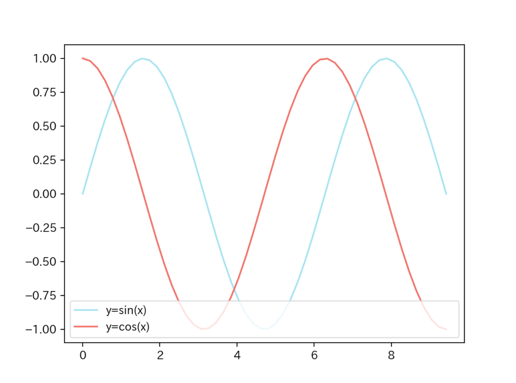
"expand"と指定引数modeに指定できるのは、"expand"とNoneの二つだけです。
凡例のタイトル(title)
凡例にタイトルを指定してみましょう。
import numpy as np
import matplotlib.pyplot as plt

x = np.linspace(0, 3*np.pi)
y1 = np.sin(x)
y2 = np.cos(x)

plt.plot(x, y1, label="y=sin(x)", color="#88E0EF")
plt.plot(x, y2, label="y=cos(x)", color="#FF5151")

# 凡例のタイトルを指定
plt.legend(title="legend title", loc="lower left")
plt.show()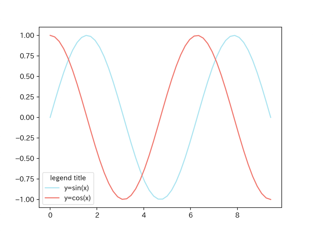
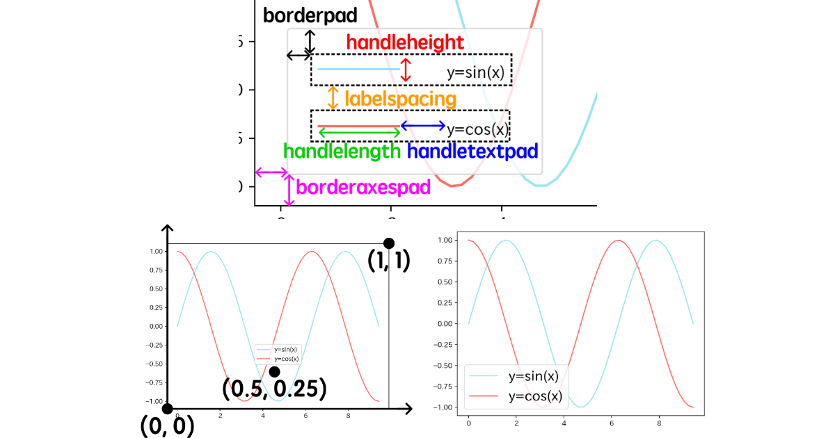
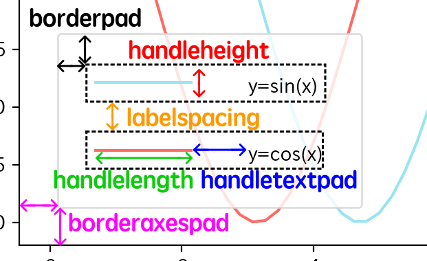
凡例のレイアウト
凡例内のラベル、マーカーの配置を指定してみましょう。(引用:matplotlib.pyplot.legend 公式ドキュメント)
| 引数名 | 意味 | デフォルト |
|---|---|---|
borderpad | 枠とラベル間の余白 | 0.4 |
labelspacing | ラベル間の余白 | 0.5 |
handlelength | 凡例ハンドルの長さ | 2.0 |
handleheight | 凡例ハンドルの高さ | 0.7 |
handoletextpad | 凡例ハンドルと ラベルテキスト間の余白 | 0.8 |
borderaxespad | 軸と凡例の境界線の余白 | 0.5 |
columnspacing | 凡例列間の余白 | 2.0 |
レイアウトのパラメータを図示すると以下のようなイメージです。
サンプルコードと凡例の表示結果を見てみましょう。
import numpy as np
import matplotlib.pyplot as plt

x = np.linspace(0, 3*np.pi)
y1 = np.sin(x)
y2 = np.cos(x)

plt.plot(x, y1, label="y=sin(x)", color="#88E0EF")
plt.plot(x, y2, label="y=cos(x)", color="#FF5151")

# 凡例のレイアウトを指定
plt.legend(borderpad=2, labelspacing=2, handlelength=5, handleheight=2,
         handletextpad=3, borderaxespad=2, loc="lower left")
plt.show()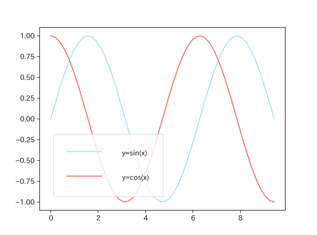
まとめ
今回はpythonのmatplotlibの凡例(legend)の使い方を具体的に紹介しました。
グラフ描画の際にぜひ活用してみて下さいね。


「Pythonの独学に苦戦している、学習方法にあまり自信がない…」という方はこちらを参考にしてみてくださいね!!