この記事ではmatplotlibライブラリでグラフの色を指定する方法をわかりやすく解説します。
サンプルコードをコピペしながらサクサク処理を試せますので、 ぜひ活用してみてください。
matplotlibライブラリを使ったグラフの描画方法はこちらを参考してみてください。
グラフの色を指定して描画
matplotlibライブラリでグラフを描画する際には、描画メソッドの引数colorで色を指定できます。
import numpy as np
import matplotlib.pyplot as plt

x = np.linspace(0, np.pi*2)
y1 = np.sin(x)
y2 = np.sin(x) + 0.5
y3 = np.sin(x) + 1
y4 = np.sin(x) + 1.5

# \\\ 線の色を指定してグラフを描画 ///
plt.plot(x, y1, color="k")
plt.plot(x, y2, color="m")
plt.plot(x, y3, color="y")
plt.plot(x, y4, color="c")
# グラフを表示
plt.show()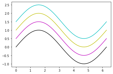
ここからは、matplotlibライブラリでのさまざまな色の指定方法ついて紹介します。
一文字で指定(色の頭文字)
最も簡単な色の指定方法です。
全8種類の中から選択することができます。指定する値は色の英語表記の頭文字です。(※黒以外)
指定できる値
指定できる値と色のイメージは以下の通りです。黒以外はすべて色の英語表記の頭文字です。
一文字で指定できる色
| 色 | 引数colorの値 |
|---|---|
| ● 赤(red) | "r" |
| ● 青(blue) | "b" |
| ● 緑(green) | "g" |
| ● 黄(yellow) | "y" |
| ● マゼンタ(magenta) | "m" |
| ● シアン(cyan) | "c" |
| ● 黒(black) | "k" |
| ○ 白(white) | "w" |
出力結果
引数colorにこれらの値を指定して、実際にグラフを描画してみます。
import numpy as np
import matplotlib.pyplot as plt
# 一文字で色を指定
color_list = ["r", "b", "g", "y", "m", "c", "k", "w"]
x = np.linspace(0, np.pi*2)
y = np.sin(x)
n = 0

# 8種類の色を指定してグラフを描画
for color in color_list:
    # plt.plot(x, y+n, color="r")のように指定する
    plt.plot(x, y+n, color=color)
    plt.text(0, n+0.5, color)
    n -= 1

# 軸の値を非表示
plt.xticks([])
plt.yticks([])
# グラフを表示
plt.show()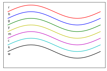
簡素なグラフを作成したいときにはとても便利な指定方法です。
一般的なグラフを描画する際には、一文字指定の方法で十分まかなえると思います。
色の名前で指定
引数colorに色の名前(英語表記)を文字列で指定することができます。
指定できる値
matplotlib公式ドキュメントで指定可能な色の名前の一覧と実際の描画イメージを確認できます。
指定できる色の名称とイメージは下図の通りです。
かなり数が多いので覚えるというより、忘れたときに再度調べる方が良いでしょう。
出力結果
実際に色の名前を指定してグラフを描画してみます。まずはサンプルコードを見てみましょう。
4行目で指定する色の名称をリストに格納しています。
import numpy as np
import matplotlib.pyplot as plt
# 色の名前で指定
color_list = ["orange", "pink", "gray", "teal", "brown", "purple"]
x = np.linspace(0, np.pi*2)
y = np.sin(x)
n = 0

# 色の名前を指定してグラフを描画
for color in color_list:
    # plt.plot(x, y+n, color="orange")のように指定する
    plt.plot(x, y+n, color=color)
    plt.text(0, n+0.5, color)
    n -= 1

# 軸の値を非表示
plt.xticks([])
plt.yticks([])
# グラフを表示
plt.show()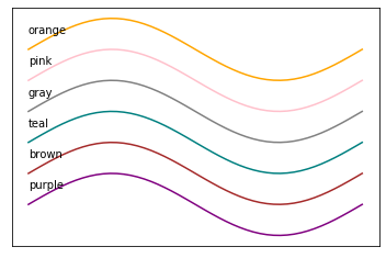
RGB, RGBAで指定
色の表現方式として代表的なRGBをmatplotlibライブラリの色指定に適用できます。
RGBとは、色の3原色 Red(赤) Green(緑) Blue(青)を組み合わせて一つの色を表現する方式です。
指定する値
matplotlibライブラリでは、引数color=(r, g, b)のようにタプル型、かつ r, g, b はそれぞれ0〜1の数値で指定します。
引数color = (R, G, B)のタプル型
RGBAで指定する場合は引数color=(r, g, b, a)のタプル型、透明度 a も0(透明)〜1(不透明)の数値で指定します。
引数color = (R, G, B, A)のタプル型
※ R, G, B, A はそれぞれ0 〜 1 の浮動小数(float)型の数値
出力結果
実際にrgb, rgba で色を指定してグラフを描画してみましょう。
5, 7行目でそれぞれ指定する色のrgb, rgbaをリストに格納しています。
import numpy as np
import matplotlib.pyplot as plt

# rgbで色を指定
rgb_list = [(0, 0, 0), (0.1, 0.5, 0.8), (1, 0.2, 0.5), (0.35, 0.8, 0.4)]
# rgbaで色を指定
rgba_list = [(0, 0, 0, 0.25), (0.1, 0.5, 0.8, 0.5), (1, 0.2, 0.5, 0.75), (0.35, 0.8, 0.4, 1)]

x = np.linspace(0, np.pi*2)
y = np.sin(x)
n = 0
# rgbやrgbaで色を指定してグラフを描画
for color in rgb_list+rgba_list:
    # plt.plot(x, y+n, color=(0, 0, 0, 0.25))のように指定する
    plt.plot(x, y+n, color=color)
    plt.text(0, n-0.5, color)
    n -= 2

# 軸の値を非表示
plt.xticks([])
plt.yticks([])
# グラフを表示
plt.show()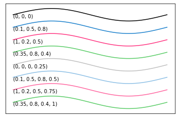
RGB, RGBAでは非常に多くの色を表現できるため、名称の無い、もしくはわからない色を指定したいときに便利です。
指定する値が(r, g, b)とタプル型であるためコードが長くなりやすいという点は弱点と言えるかもしれません。
しかしながら、数値だけで色を表現できるためプログラム処理の幅を広げてくれるという点で大きな魅力と言えるでしょう。
16進数カラーコードで指定
色の表現方法に16進数カラーコードというものがあります。
指定する値
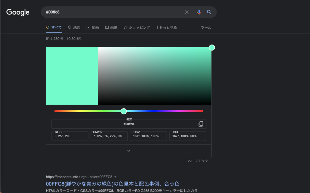
16進数カラーコードの色を調べるには、こちらのサイトが参考になります。

他にもGoogleの検索窓に適当なカラーコード(#000000など)を入力して検索すると、以下のように色を調べることができます。(※ HEX のところが16進数カラーコードを表します。)
出力結果
では、実際に16進数カラーコードで色を指定してグラフを描画してみましょう。
import numpy as np
import matplotlib.pyplot as plt

# 16進数カラーコードで指定
color_list = ["#ff0033", "#ac83f3" , "#ddaa22", "#234512"]

x = np.linspace(0, np.pi*2)
y = np.sin(x)

n = 0
for color in color_list:
    # plt.plot(x, y+n, color="#ff0033")のように指定する
    plt.plot(x, y+n, color=color)
    plt.text(0, n-0.5, color)
    n -= 2

# 軸の値を非表示
plt.xticks([])
plt.yticks([])
# グラフを表示
plt.show()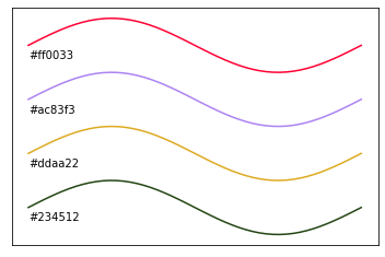
16進数カラーコードは、値と色の関連性をイメージするのが難しいため、直感的に何色を選んでいるのかわかりにくいという特徴があります。
しかしながら、ピンポイントで「この色を使いたい!!」というときには非常にありがたい指定方法です。
カラーマップで指定
カラーマップで色指定することでグラデーションのかかった鮮やかなグラフを描画できます。
指定できる値
matplotlibライブラリには標準使用できるカラーマップが用意されており、それらの中から選んで色を指定できます。
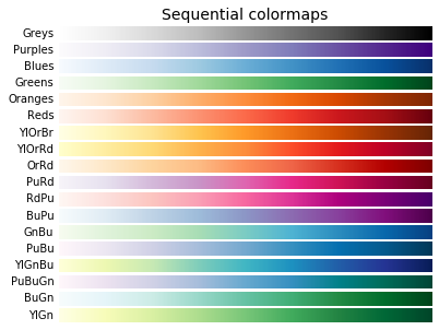
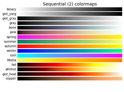
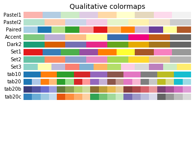
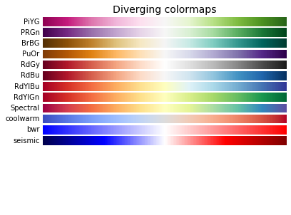
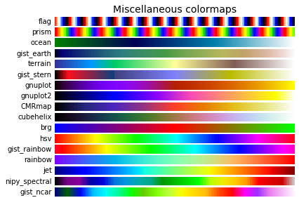
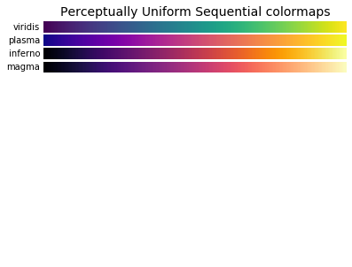
(引用 : matplotlib公式ドキュメント)
カラーマップを用いて色を指定する場合、あらかじめカラーマップインスタンスを作成する必要があります。
下記のように、get_cmap()メソッドを使用してカラーマップインスタンスを作成します。
color_map = plt.get_cmap(カラーマップ名)
その後、作成したカラーマップインスタンスを使用して引数color=color_map(0〜1の数値)として色を指定します。
出力結果
実際にカラーマップで色を指定してグラフを描画してみましょう。
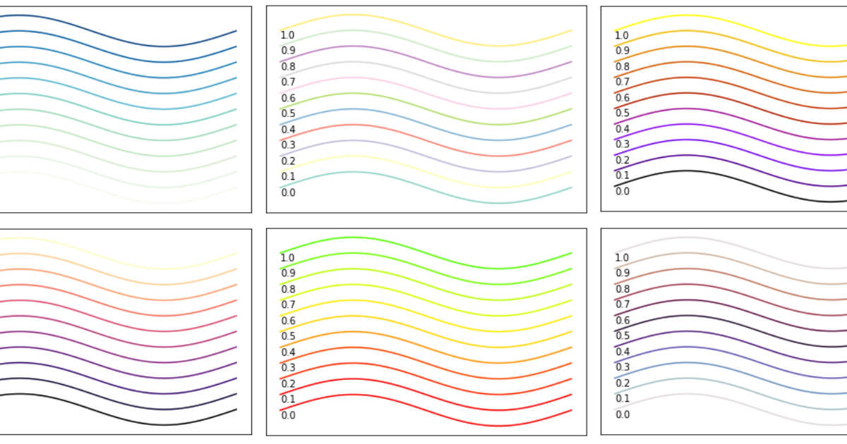
4行目で6種類のカラーマップをリストに格納しています。
12行目でカラーマップインスタンスを作成し、14行目で色を指定しています。
import numpy as np
import matplotlib.pyplot as plt
# カラーマップを指定
color_map_list = ["GnBu", "Set3" , "prism", "magma", "twilight", "gnuplot"]

x = np.linspace(0, np.pi*2)
y = np.sin(x)
# カラーマップごとに0〜1の値で色を変えて10本描画
for color in color_map_list:
    for n in range(11):
        # ↓↓↓ カラーマップインスタンスをplt.get_cmap("GnBu")で作成
        color_map = plt.get_cmap(color)

        # ↓↓↓ 指定したカラーマップの0〜1に対応する色で描画
        plt.plot(x, y+n, color=color_map(n/10))
        plt.text(0, n-0.5, n/10)
        n -= 2

    plt.xticks([])
    plt.yticks([])
    plt.show()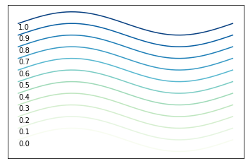
"GnBu"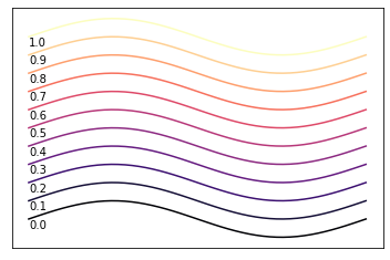
"magma"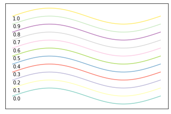
"Set3"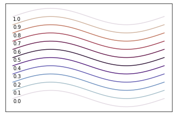
"twilight"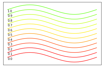
"prism"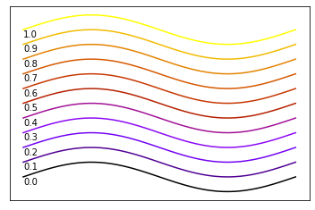
"gnuplot"カラーマップを使用することでグラデーションのかかったグラフを描画することができました。
鮮やかで印象的なグラフを作成するときにはとても便利な方法です。
カラーマップのインスタンスを作成するひと手間が必要なので、単に色をつけてグラフ描画したい場合はこの方法は不向きかもしれません。
一度は試したくなる描画方法なのではないでしょうか。
まとめ
今回はpythonのmatplotライブラリで色を指定する方法を具体的にご紹介しました。
さまざまな色の指定方法があるため、ご自身が一番使いやすいもので指定すると良いと思います。
他にもmatplotlibライブラリを使った、グラフ描画に関する記事を用意しているので活用してみてください。
「Pythonを独学しているけど思うように進まない…、やり方が本当に合っているのか自信がない…」という方はこちら!!